Fresh Kosher Cruises
Brand Guidelines & Design System
Site-wide header & hero standard
Updated October 21, 2026. This is the required system for all public site pages and all future redesigns. These specifications take precedence over older examples below. A visitor should recognize Fresh Kosher Cruises before reading the page title.
One identity: navy structure, white type over photography, magenta actions, Poppins headings and Open Sans body copy. Change the photograph and content to suit the page; keep the header, title treatment, overlay and alignment consistent.
Navigation
Use the shared navigation partial on every public page. Over a photographic hero, the fixed navbar is fully transparent at the top: the photograph continues behind the white logo and links, with no navy bar, border or shadow. Readability comes from a dark scrim on the hero image itself. After scrolling more than 50px, the navbar becomes solid navy #061A60 with a subtle shadow; returning to the top restores transparency. Utility pages and the open mobile menu use solid navy. Use the white SVG logo at 40px high, white links, and magenta for the current page and hover. Keep the same link order, desktop spacing and mobile menu. The desktop menu collapses below 1200px. Controls must have at least a 44px target.
 After scrolling / utility pages: solid navy
Photographic hero
Use for About, Contact, reviews, destinations, port guides, dining and planning articles, and categories. Use one relevant photograph, the shared navy overlay, start-aligned copy, one white H1 and a short supporting paragraph. A white eyebrow with a short magenta rule is optional. Use one magenta primary action and, when needed, one white secondary link. WhatsApp actions use the green WhatsApp component, with the original magenta outline retained on sailing cards. Headings stay white throughout; do not add a separate pink headline treatment.
At the top: transparent over the photograph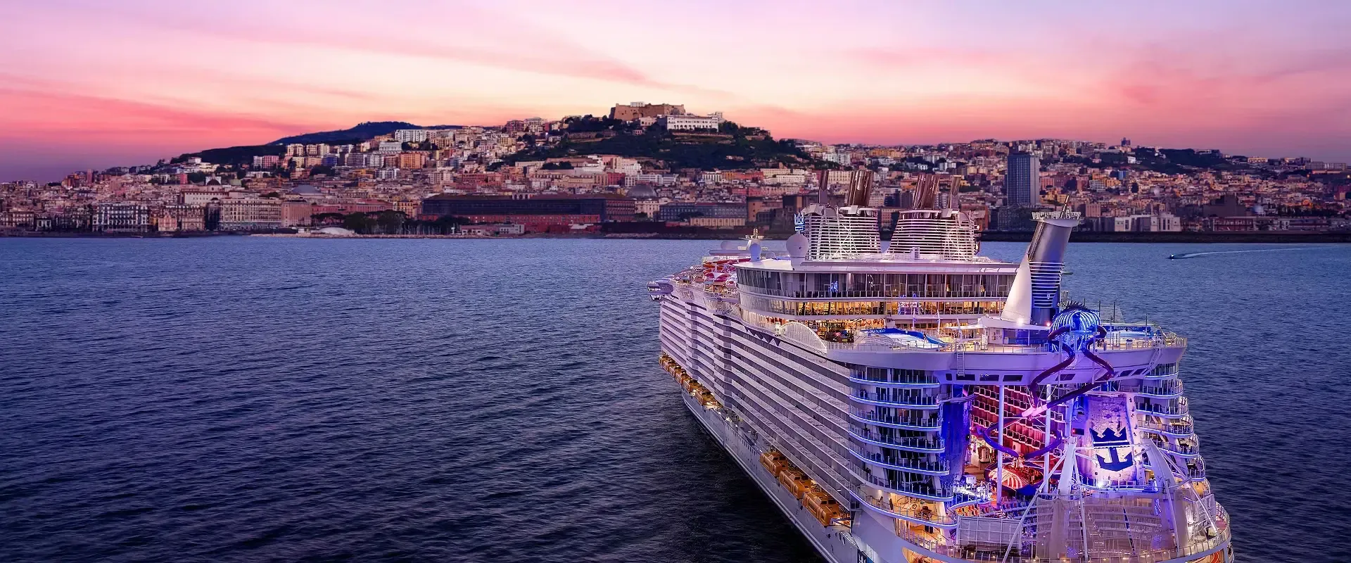
Fresh Kosher Cruises
See the world. Feel right at home.
Exceptional journeys, thoughtfully planned around your kosher life.
Compact utility hero
Use the same white title, spacing scale and magenta action on a solid navy background for booking, payment, account, policy and confirmation pages. Keep the task close to the top of the page. Contact is a public travel page and uses the photographic hero, matching About and destinations.
Here for your journey
How can we help?
Talk to our team about your next kosher cruise.
Specimens above are scaled for this reference page. The dimensions below apply to the live site. Standalone brand, brochure and developer reference pages may use their document layouts.
| Property | Desktop / tablet | Mobile ≤767px |
|---|---|---|
| Content width | 1320px maximum; 48px minimum outer gutters | 20px outer gutters |
| Photo hero | 520px minimum; padding 144px top / 64px bottom, including fixed-header clearance | 420px minimum; padding 116px / 48px |
| Utility hero | 300px minimum; padding 120px / 48px | 260px minimum; padding 112px / 40px |
| Finder hero | 600px minimum for the search controls | 440px minimum with the shared finder launcher |
| H1 | Poppins 700; fluid 36–56px; line-height 1.15; tracking −0.025em; max-width 850px | Same fluid scale, minimum 36px. Allow wrapping and content-driven height. |
| Supporting copy | Open Sans 18px / 1.7; max-width 650px | 16px / 1.7 |
| Actions | Magenta primary, white text, 8px radius, minimum 48px height. Secondary action is white with an underline or a white outline. Sentence case; no extra hero-specific button palette. | |
| Photography & contrast | Use existing genuine cruise, destination or onboard photography with a navy overlay from --brand-hero-shade. Keep subjects visible; maintain at least 4.5:1 contrast for supporting text. The overlay reverses for RTL. | |
Sailing detail heroes: retain the centered cruise-line logo, ship name, itinerary facts and booking actions, with the existing ship-specific photograph and overlay. On mobile, use compact headings and centered stacked actions. The shared header and WhatsApp component still apply.
Allowed variation: image crop, translated copy, cruise-line logo, itinerary facts and finder controls. Height may grow to fit content. Do not introduce cream backgrounds, a new header shade, split-image article heroes, per-page font scales, or a new accent color.
One page width and shared surfaces
The established site shell is 1320px maximum, centered, with 48px minimum gutters above 767px and 20px gutters on mobile. Navigation, hero copy, main sections, calls to action and the footer align to the same shell. Full-width photography and background colors extend to the viewport edge.
--brand-content-width and --brand-gutter own these dimensions in brand-system.css. Bootstrap .container and the existing .page-container, .about-container and .guide-container all use those tokens. Nested containers fill their parent rather than subtracting the gutters again. Do not create a separate 1140px or 1200px page shell in a page stylesheet.
A reading column, individual form or card may be narrower inside the shared shell. Use the existing 8px / 12px / 16px radius tokens, cool-white section background, cool borders and shared shadow scale. Contact uses the same booking-form.css cards and form controls as the booking flow, with 16px input text, navy headings and a magenta submit action.
WhatsApp actions
Use btn btn-whatsapp for direct-message and group-join buttons on Contact, hero actions, sailing detail pages, newsletter, footer and the WhatsApp invitation page. These buttons use white text and icons on WhatsApp green. Preserve the destination URL and message. Sailing cards are the exception: retain their original square magenta outline WhatsApp action beside the sailing button.
WhatsApp green #25D366 with white text and icons #FFFFFF in every context and interaction state. Use 16px / 700 type, 24px line-height, 12px × 24px padding, 1px border, 8px radius and a minimum 48px target. Hover uses #1DB954; text and icons remain white. Use a visible focus ring.
The icon precedes the label with a 10px gap and reverses naturally in RTL. Let long translations wrap. The floating chat launcher keeps its 56px circular shape and uses WhatsApp green with a white icon. Text phone links and compact share controls retain their own layout.
Sailing card exception: preserve the original 50px square action (44px on mobile), 2px magenta border, magenta WhatsApp icon and 10px radius. On hover, fill it magenta with a white icon. Keep its original spacing and accessible label. Do not apply btn-whatsapp to this card action.
All WhatsApp component styling lives in brand-system.css. Do not add newsletter, footer, sailing or per-page overrides for its colors, type, radius, padding or hover behavior.
2026 design direction
Our application of the research: build a recognizable visual system, use confident typography and genuine travel imagery, keep introductory copy concise, and help visitors choose their next step. Trends guide presentation; the established navy and magenta identity remains the foundation.
- Webflow: 8 web design trends to watch in 2026 (January 8, 2026) highlights proprietary visual systems, concise copy, scannable overviews and guided navigation. Apply these through shared components, clear introductions, chapter links and useful actions.
- Wix: The 11 biggest web design trends of 2026 highlights expressive hierarchy and human storytelling through visuals while advising designers to retain brand identity and performance. Apply a strong title hierarchy and relevant photography within our existing palette.
- W3C: Consistent Navigation supports predictable repeated navigation. Preserve menu order and controls across pages.
Use restrained 200ms feedback, visible keyboard focus and reduced-motion support. Avoid autoplay hero video, animated headlines, scroll hijacking and decorative effects that delay access to travel information.
Implementation & review
src/_includes/macros/brand.njk owns the reusable hero markup. src/styles/brand-system.css owns all header and hero presentation and is loaded after page styles by the base layout. Existing category and finder templates use the same tokens. Sailing detail banners use inner-banner--sailing to preserve their centered layout and ship-specific overlays. Editorial and guide macros delegate to the brand macro.
For a new page, import hero from macros/brand.njk and pass translated title, subtitle, eyebrow, image, optional url/cta, or compact: true. Keep page styles limited to the content below the hero. Change shared tokens when changing the system.
Before accepting a redesign: visually compare it with the homepage, About, Contact and a sailing at desktop and mobile widths. Check that the navigation, hero, main content and footer share the same left and right edges, and compare WhatsApp buttons across the hero, content, newsletter and footer. Verify transparent navigation over photography, navy after scrolling, the mobile menu, working links and forms, no clipped text at 320px, visible focus, and Hebrew RTL alignment. Run node scripts/check-brand-system.cjs and inspect the screenshots. Use the existing base layout for language and agent branding support.
1. CSS Variables & Design Tokens
The design system uses CSS custom properties for consistent theming and easy maintenance.
Primary Variables
:root {
  --primary-color: #061A60;
  --secondary-color: #CC004E;
  --tertiary-color: #FF6700;
  --whatsapp-green: #25D366;
  --font-color: #1A1D29;
  --color-muted: #667085;
  --light-bg: #F5F8FF;
  --card-border: #E6EBF4;
  --success-color: #28a745;
  --danger-color: #dc3545;
  --box-shadow: 0 4px 12px rgba(0, 0, 0, 0.08);
  --transition: all 0.25s cubic-bezier(0.4, 0, 0.2, 1);
}
2. Logo Usage
Primary Logo (SVG - Blue on Light Background)
File: https://freshkosher.cruises/assets/images/fresh-kosher-cruises.svg
Usage: Preferred for light backgrounds. Scalable vector format.
Alternative Logo (White SVG - for Dark Backgrounds)
File: https://freshkosher.cruises/assets/images/fresh-kosher-cruises-white.svg
Usage: Used on dark backgrounds (e.g., main navigation).
Favicon

File: https://freshkosher.cruises/favicon.svg
Guidelines:
- Ensure sufficient clear space around the logo.
- Do not distort, recolor, or alter the logo.
- Maintain aspect ratio.
- Use SVG version where possible for scalability.
3. Color Palette
Usage Notes:
- Primary (#061A60): Main navigation, footers, backgrounds, headings.
- Secondary (#CC004E): Call-to-action buttons, accents, highlights, progress indicators.
- Tertiary (#FF6700): Reserved for existing offer labels; never use for header, hero or primary actions.
- WhatsApp Green (#25D366): Exclusively for WhatsApp related buttons and icons.
- Text Dark (#1A1D29): Primary text color for body content.
- Text Muted (#667085): Secondary text, labels, descriptions.
4. Typography
Font Stack
- Headings: 'Poppins', sans-serif (font-weight: 600)
- Body Text: 'Open Sans', sans-serif
- Brand Elements: 'Montserrat', sans-serif
Font loading
Use the locally hosted Poppins and Open Sans WOFF2 files already loaded by the shared stylesheet. Hebrew uses Heebo throughout. Do not add per-page Google Fonts imports or new heading families.
Headings (H1-H6)
- Color:
#061A60(var(--primary-color)) - Font-weight: 600-700 for headings
Body Text (P, Li)
- Font size:
16px(1rem) - Color:
#1A1D29(var(--font-color)) - Line-height:
1.6
6. Form Elements
Text Input
Classes: .form-control
Style: Background #f7f8fc, border #e9ecef, focus border #061A60
Gender Selection
Classes: .gender-option
Style: Custom radio button styling with gender-specific colors
Card Selection Options
Classes: .ship-section-option, .deck-option, .preference-option
Style: Card-based selection with hover effects and checkmark indicators
7. Progress Indicator
Classes: .progress-bar-container, .progress-step, .step-circle, .step-label
States: .active (current step), .completed (finished steps)
8. Booking Summary Widget

Your Cruise Summary
Classes: .booking-summary-widget, .detail-item, .icon
Style: Sticky sidebar widget with cruise details and call-to-action
9. Alert Components
Info Alert
Important Information
This is an informational alert with an icon and structured content.
Classes: .alert .alert-info
Light Alert
Note
This is a light alert with custom styling.
Classes: .alert .alert-light
10. Iconography
Library: Font Awesome 6.5.2 (via CDN)
- Solid Icons:
<i class="fas fa-ship"></i>(prefixfas) - Brand Icons:
<i class="fab fa-whatsapp"></i>(prefixfab) - Gender Icons:
fas fa-male,fas fa-female - Direction Icons:
fas fa-arrow-left,fas fa-arrow-right,fas fa-left-right - Preference Icons:
fas fa-elevator,fas fa-volume-off,fas fa-door-closed - Date/Time:
fas fa-calendar-days,fas fa-moon
11. Responsive Design
The design system is mobile-first and includes responsive breakpoints:
- Mobile: < 576px - Single column layouts, fixed bottom buttons
- Tablet: 576px - 992px - Two-column card grids
- Desktop: > 992px - Full multi-column layouts
Key Responsive Features:
- Fixed bottom button container on mobile
- Collapsible navigation with hamburger menu
- Sticky booking summary widget on desktop
- Adaptive card grid layouts
12. Interaction & Motion
Hover and transition effects follow a consistent system to create predictable, polished interactions.
Standard Transition
All hover transitions use 0.25s ease-out for a snappy, natural feel. This applies to buttons, cards, links, and any element with a hover state.
Hover Lift Tiers
| Tier | Distance | Use For |
|---|---|---|
| Subtle | translateY(-2px) |
Tabs, newsletter subscribe, secondary actions, WhatsApp buttons |
| Prominent | translateY(-4px) |
Clickable cards, Book Now buttons, primary CTAs |
Rules
- Non-interactive elements (stat cards, feature boxes, highlight cards) should NOT have hover lifts — only subtle shadow changes
- Touch devices: All transform and box-shadow hover effects are wrapped in
@media (hover: hover)to prevent stuck states on touch - Color-only hover changes (background, text color) do NOT need the media query guard — they work fine on touch as active-state indicators
- Primary buttons hover to orange; secondary buttons (ghost/outline style) hover to filled white with navy text — they must remain visually distinct
13. Focus States
Keyboard focus indicators use :focus-visible so they appear only during keyboard navigation, not on mouse clicks.
| Element | Style |
|---|---|
| Default (all focusable) | outline: 2px solid var(--secondary-color); outline-offset: 2px |
| Buttons | Same outline + box-shadow: 0 0 0 4px rgba(204,0,78,0.25) |
| Nav links (dark bg) | outline: 2px solid var(--neutral-color); outline-offset: -2px |
14. Shadow Scale
Shadows follow a 3-step scale for rest, hover, and active states:
| State | Shadow | Example |
|---|---|---|
| Rest | 0 2px 10px rgba(0,0,0,0.08) |
Cards at rest |
| Hover | 0 15px 40px rgba(0,0,0,0.15) |
Clickable cards on hover |
| Elevated | 0 8px 25px rgba(204,0,78,0.4) |
Book Now buttons on hover (brand-tinted) |
15. Tone of Voice
Professional, trustworthy, exciting, aspirational, informative, clear, customer-focused, and welcoming.